ENTERPRISE SOFTWARE REDESIGN
Background
Comprehend (YC W11) is a business intelligence tool for clinical trials. Although the original application had a powerful backend, it was confusing for many users due to the lack of a clear flow and a general misinterpretation of user needs. I was brought in as the first designer to reimagine the product from scratch.
The startup raised $21M in Series B funding ten months after I joined. During this project, I worked closely with product managers, a scrum team of 10 engineers and another designer to ship Comprehend 2.0.

Comprehend 2.0
My Role
I led the UX work, gathered and refined product requirements, conducted workshops and usability testing, produced prototypes, high fidelity mockups, and facilitated design review sessions. I collaborated with another product designer whom I recruited as our company grew.
Throughout the project, I met with product managers and a lead developer reguarly to continue to improve the design process within the agile environment. I advocated for incorporating activities — especially exploratory user research, brainstorming sessions, user testing — within the development cycle to ensure the quality of the design solutions.
To increase design transparency, I introduced a bi-weekly design show and tell to go through my latest design with everyone who is interested. These discussions allowed developers to get a glimpse of the upcoming features and helped us check feasibility and catch corner cases.
Understanding the Industry
The clinical trial industry is highly regulated and the workflows are complicated. To understand our customers and users' needs and painpoints, I tagged along when the professional service team visited customers and used methods like contextual inquiry and fly-on-the-wall. I also enrolled in clinical trial trainings and studied workflows in order to understand the interactions between various roles (e.g. Clinical Research Associates, Data Managers) and the protocols that they follow (e.g. Serious Adverse Event handling process).

Observing existing customer using the previous version of the software.
Product Goals
As the first designer at a small startup, I had a lot of freedom and opportunity to define the product goals. Through stakeholder interviews, competitive analysis, and co-design workshops with internal and external users, we identified the following product goals and design principles:
Our primary goals of the redesign
Provide oversight of all clinical trial studies in real-time
Proactively help users identify highest operational and data quality risks
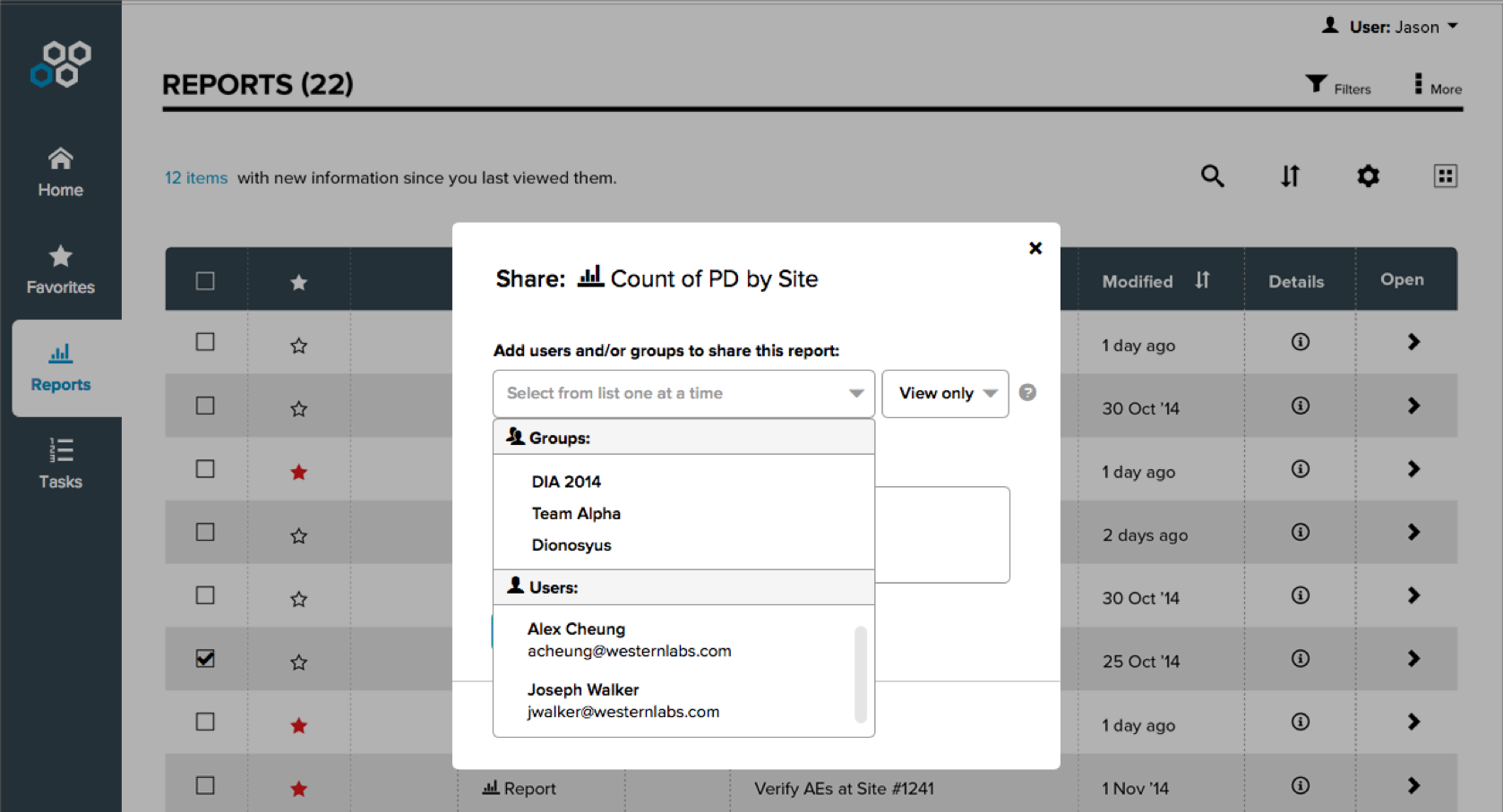
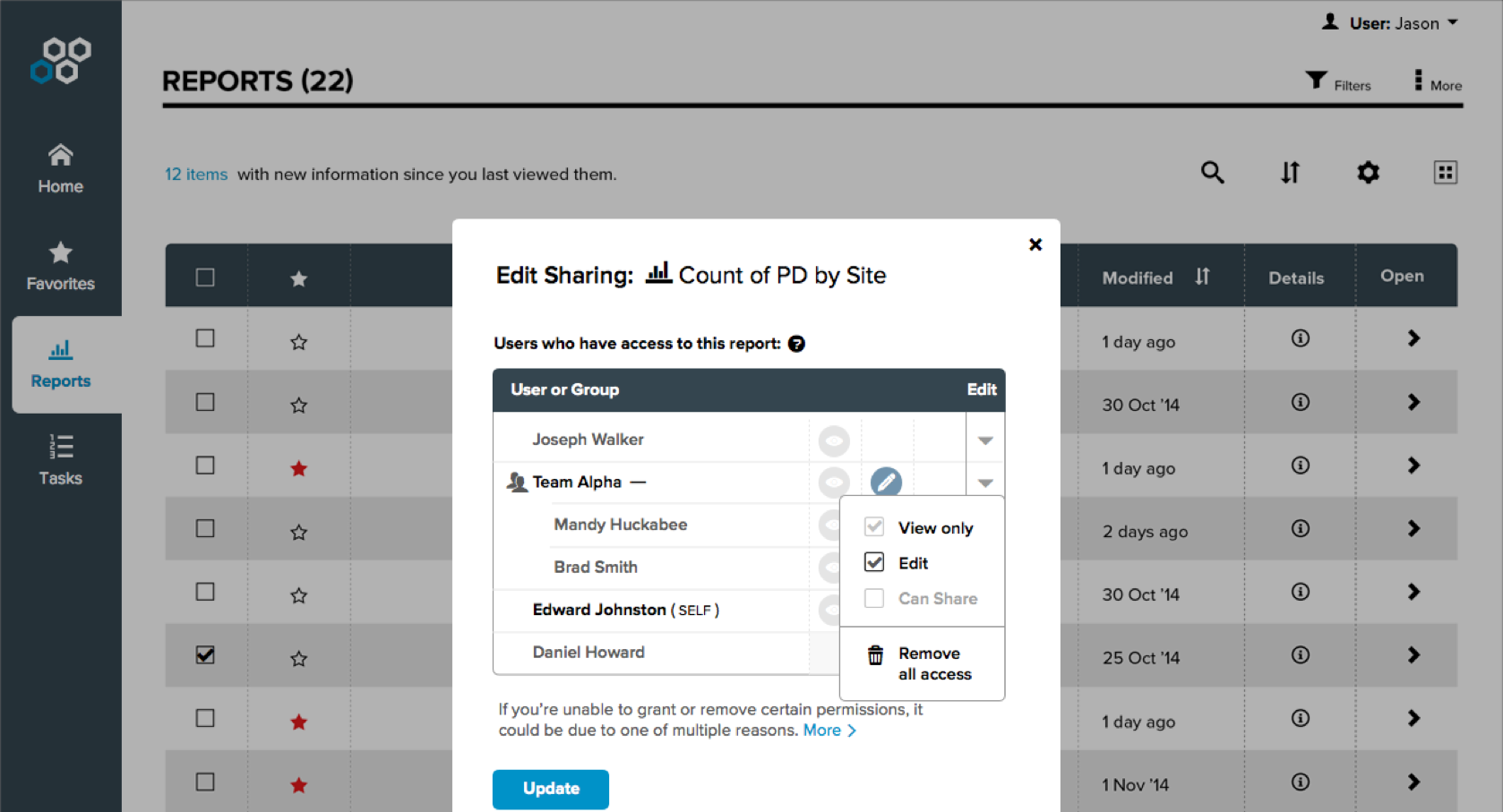
Allow users to collaborate and address operational issues
Design principles
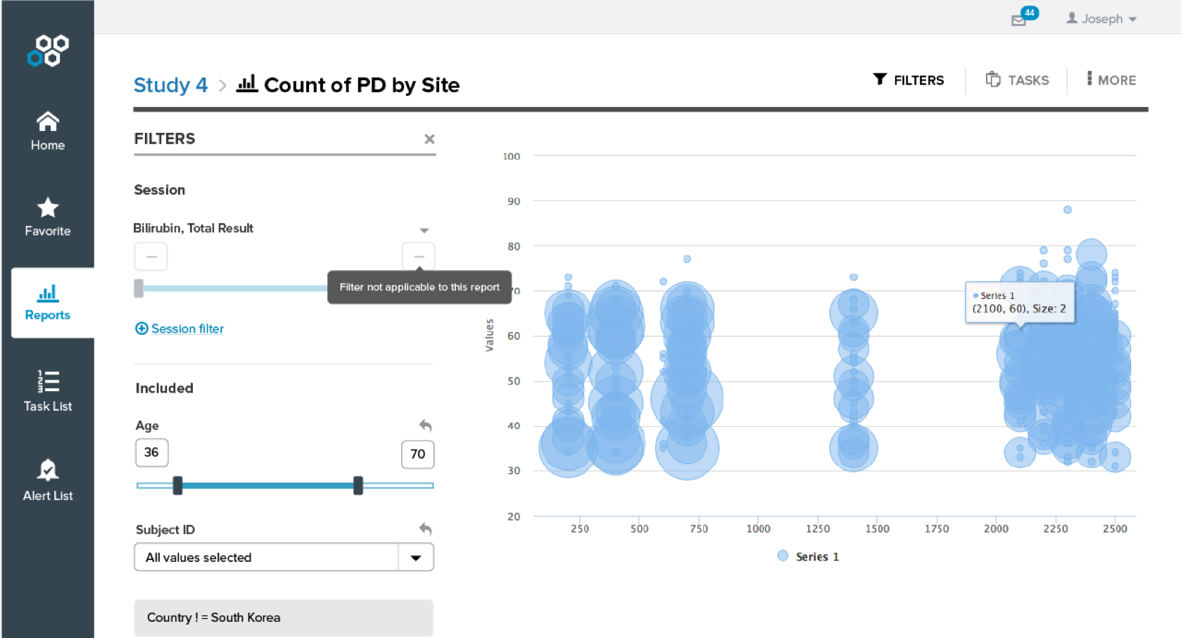
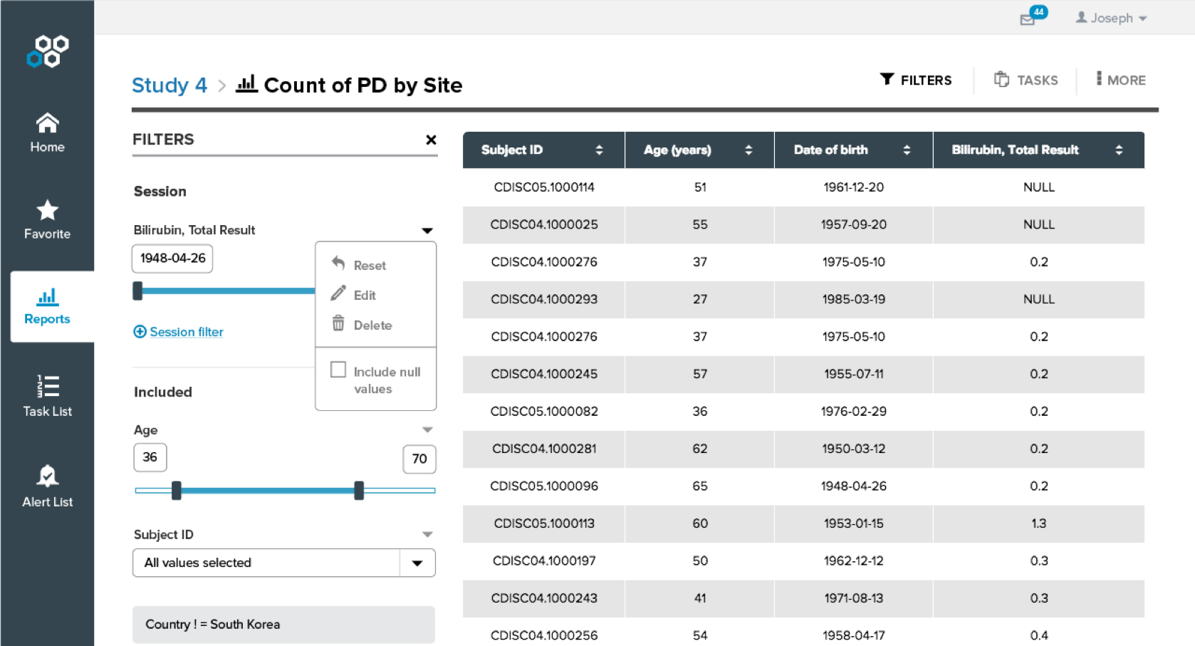
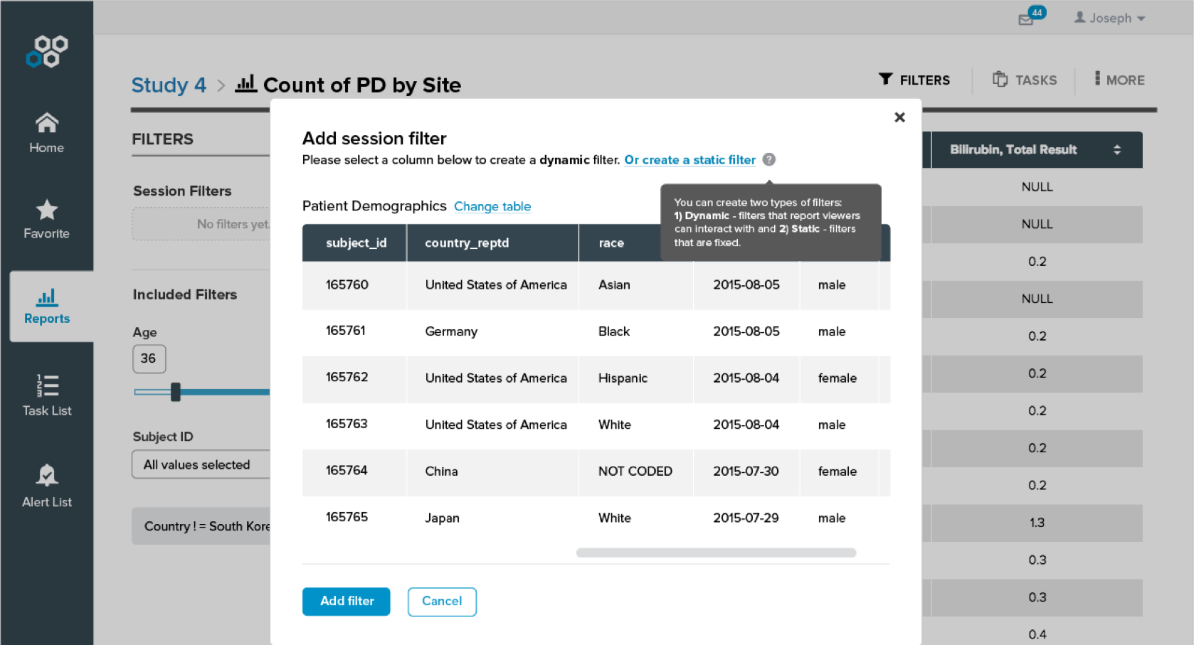
Data exploration needs depend on context. Users need to monitor the baseline data on a regular basis and to deep dive when there are potential operational issues.
Inspire confidence in visualizations. Users need to be able to trust the data in our tool, and data transparency is a key factor.
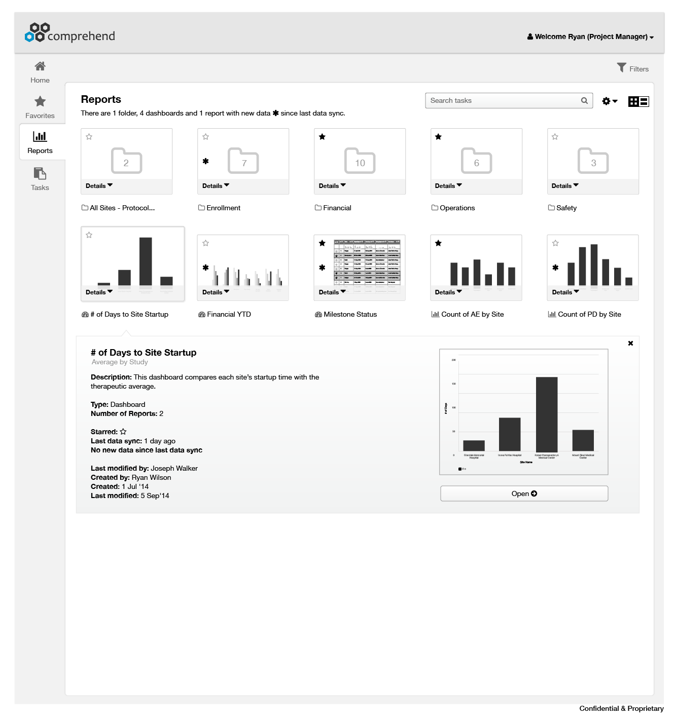
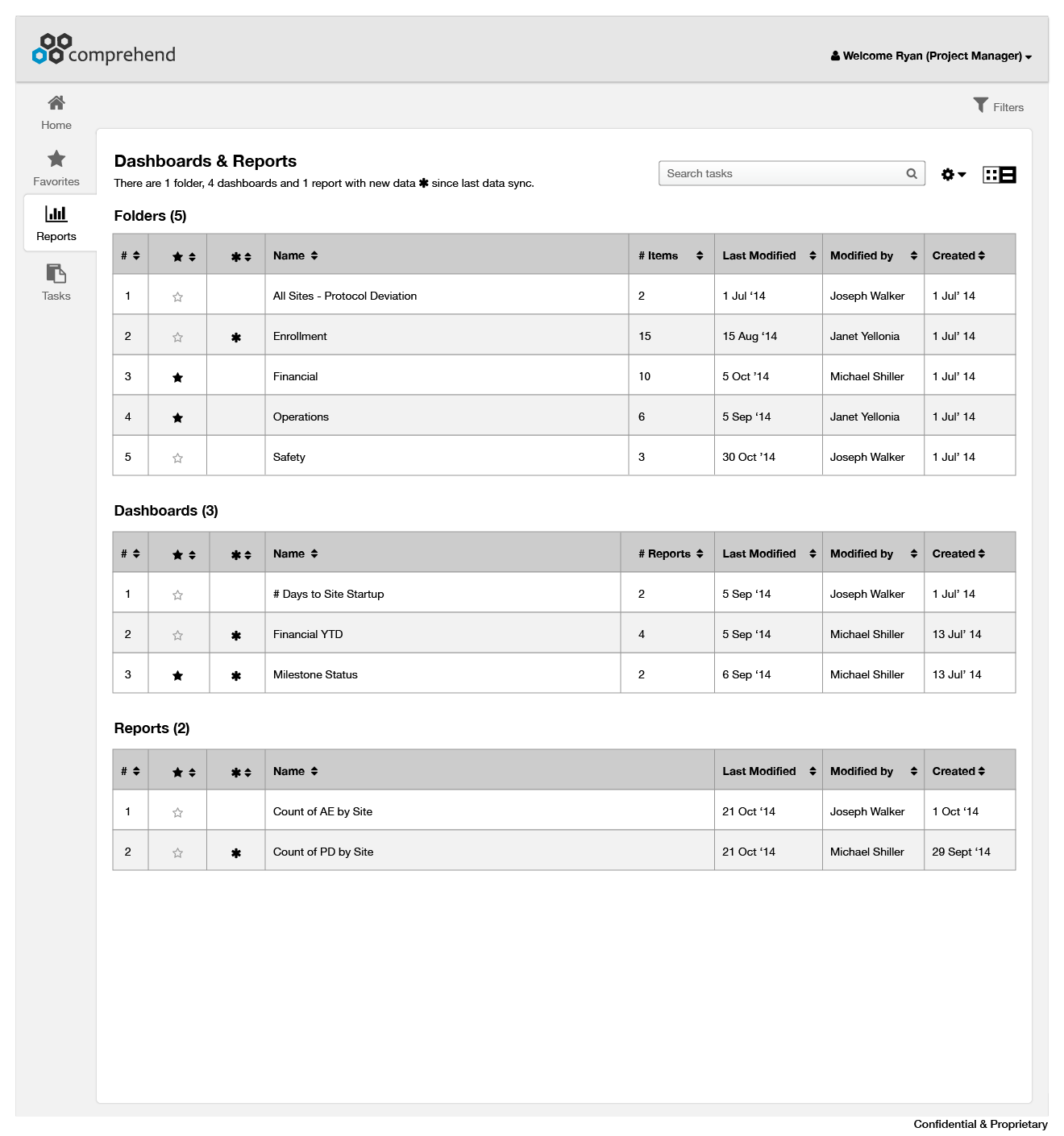
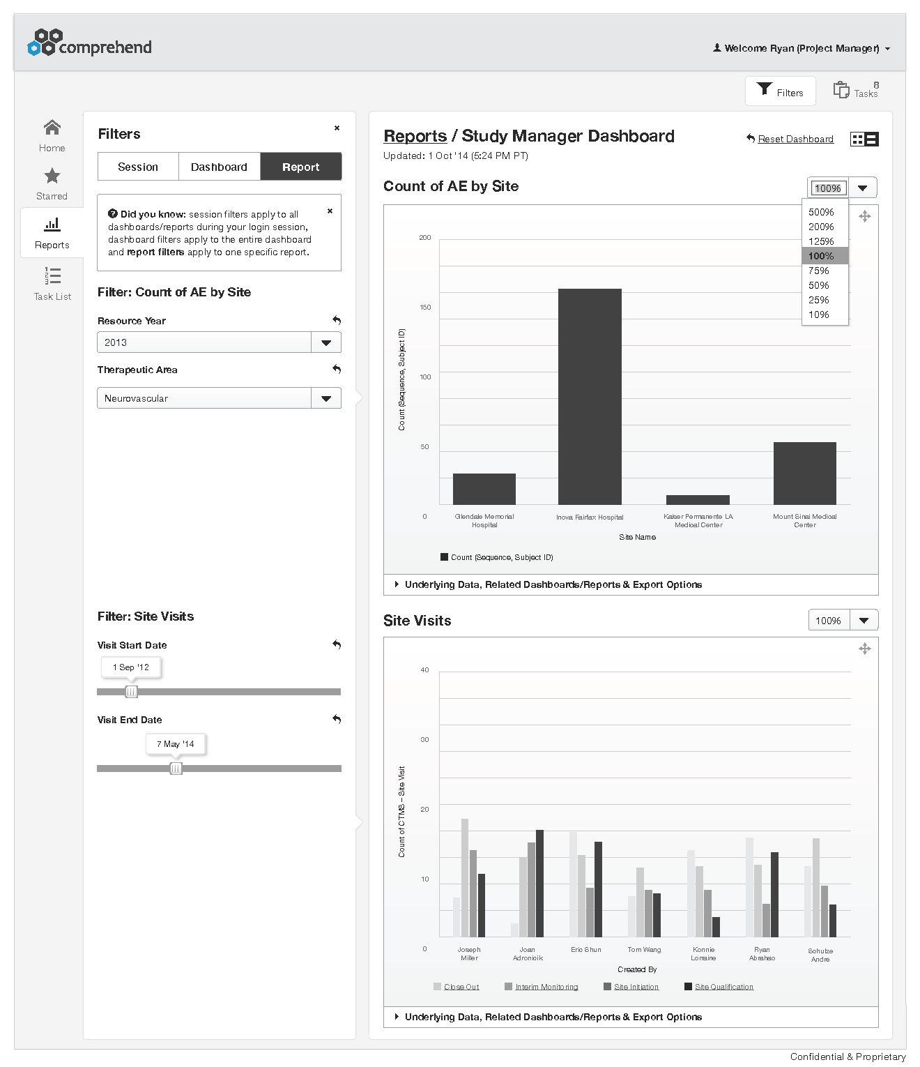
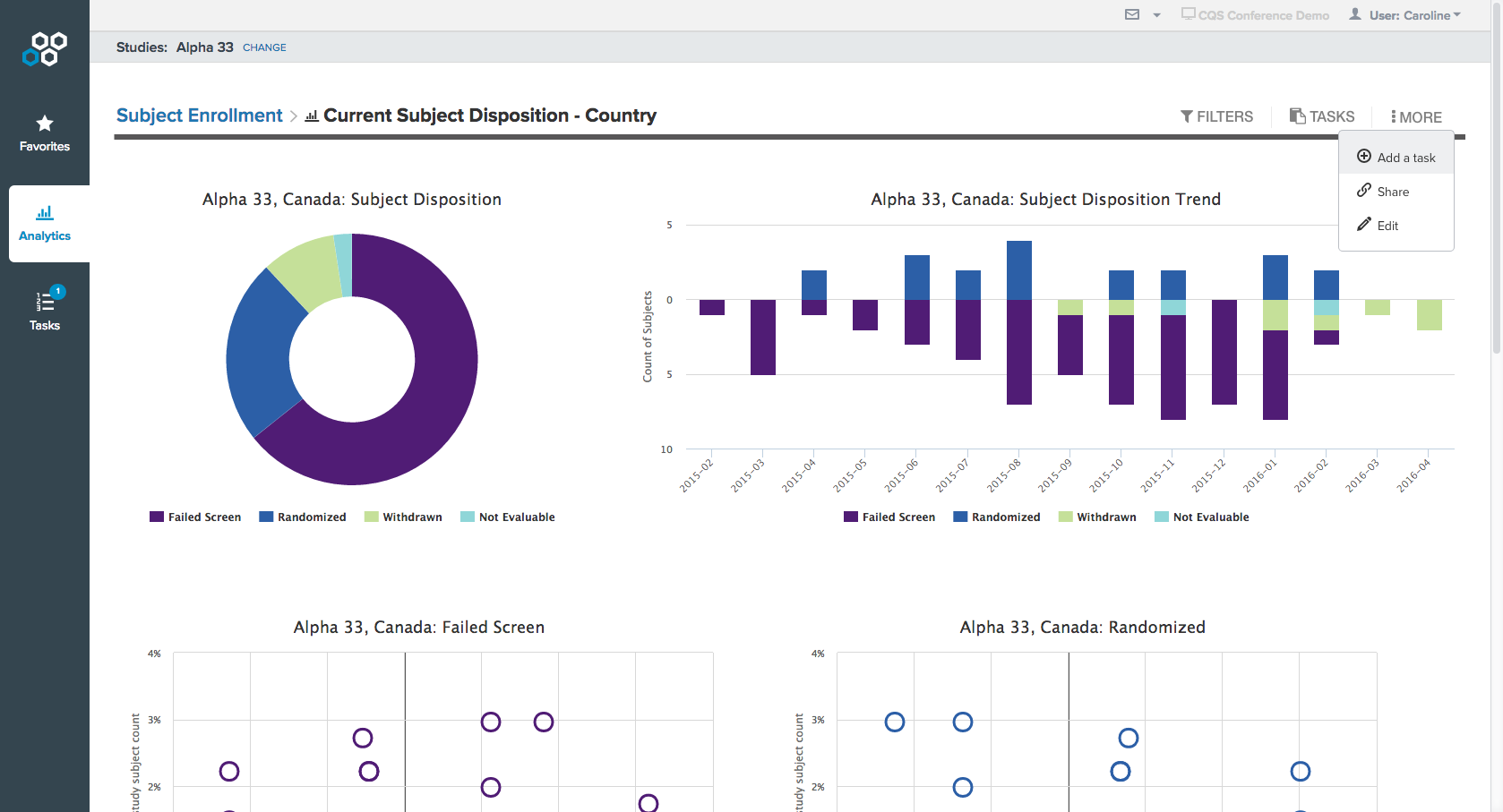
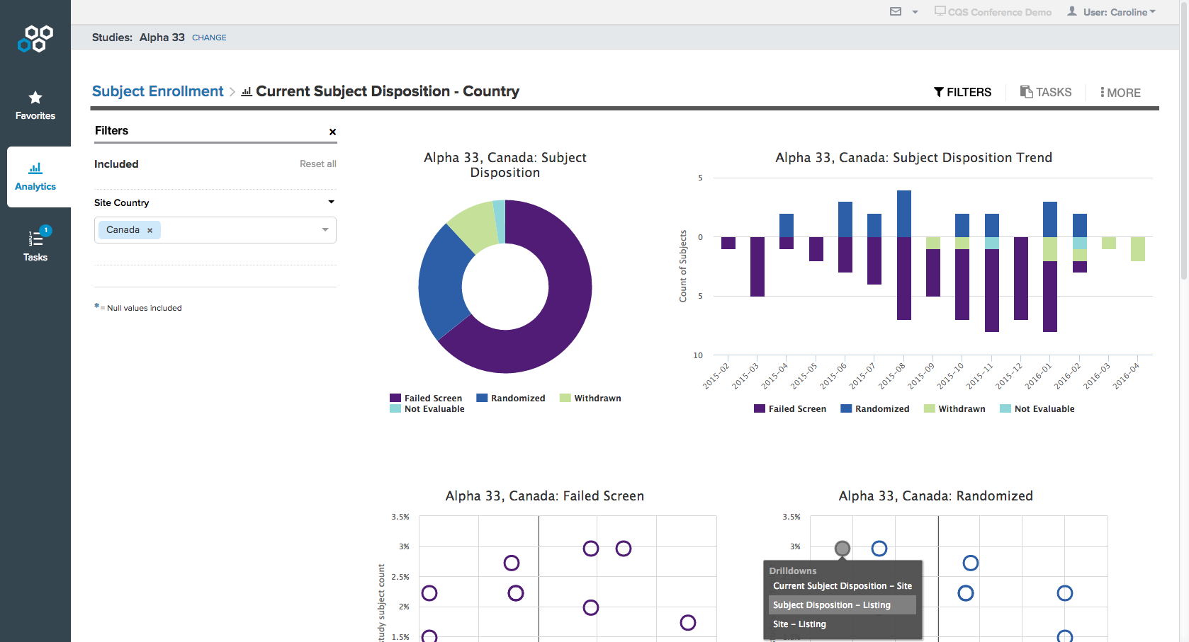
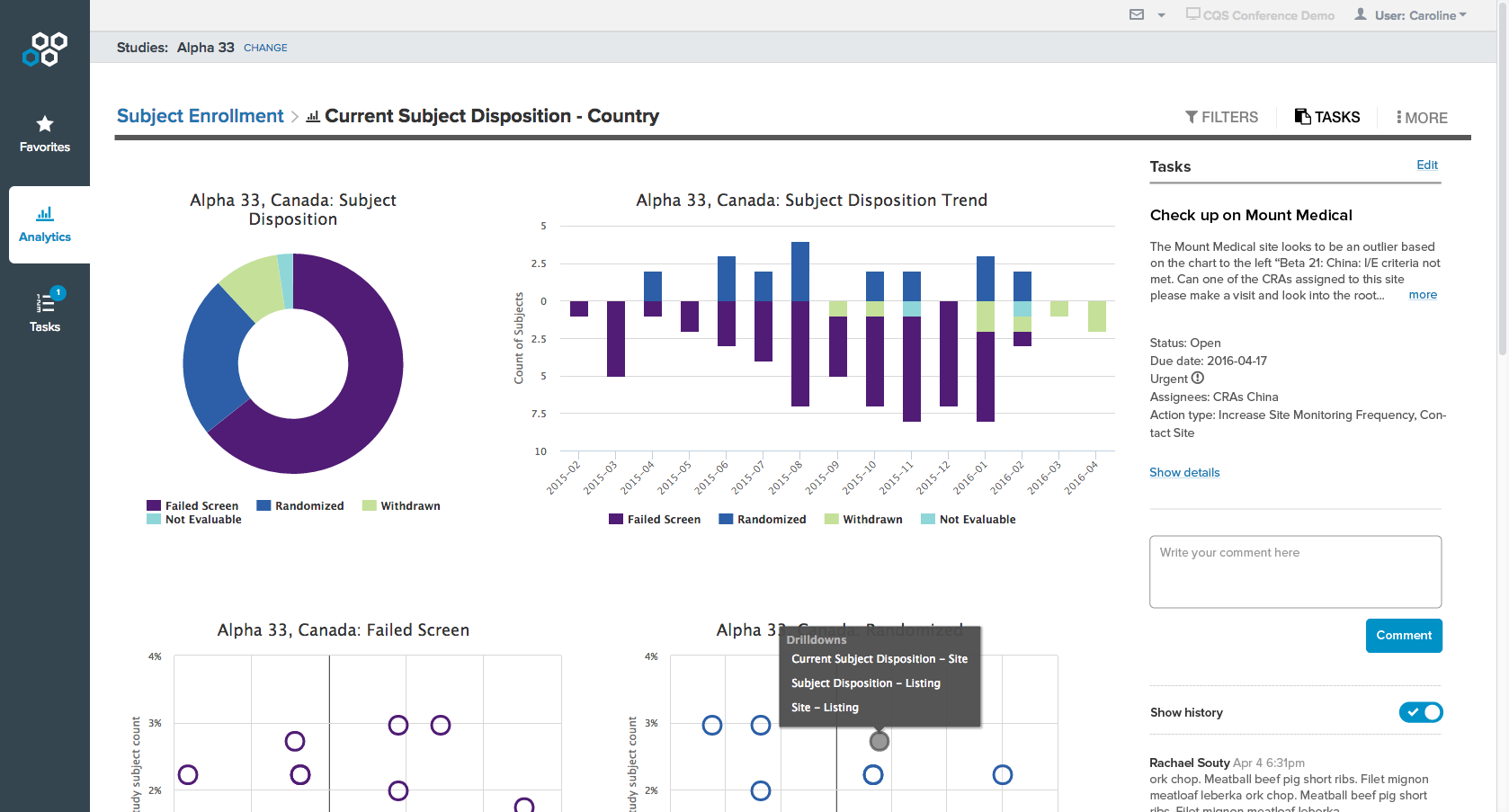
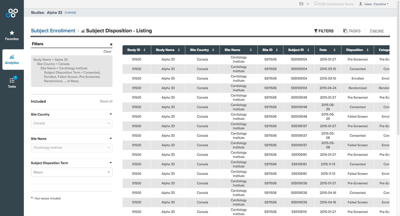
Creating & viewing data are different needs. In the previous version, a user can create and view data at the same time. Since the goals vary dramatically in these two modes, the previous UI lacked a clear flow. In our redesign, we decided to separate the creating and viewing modes, so that each workflow can be optimized.

Co-design workshop
Getting Internal Alignment
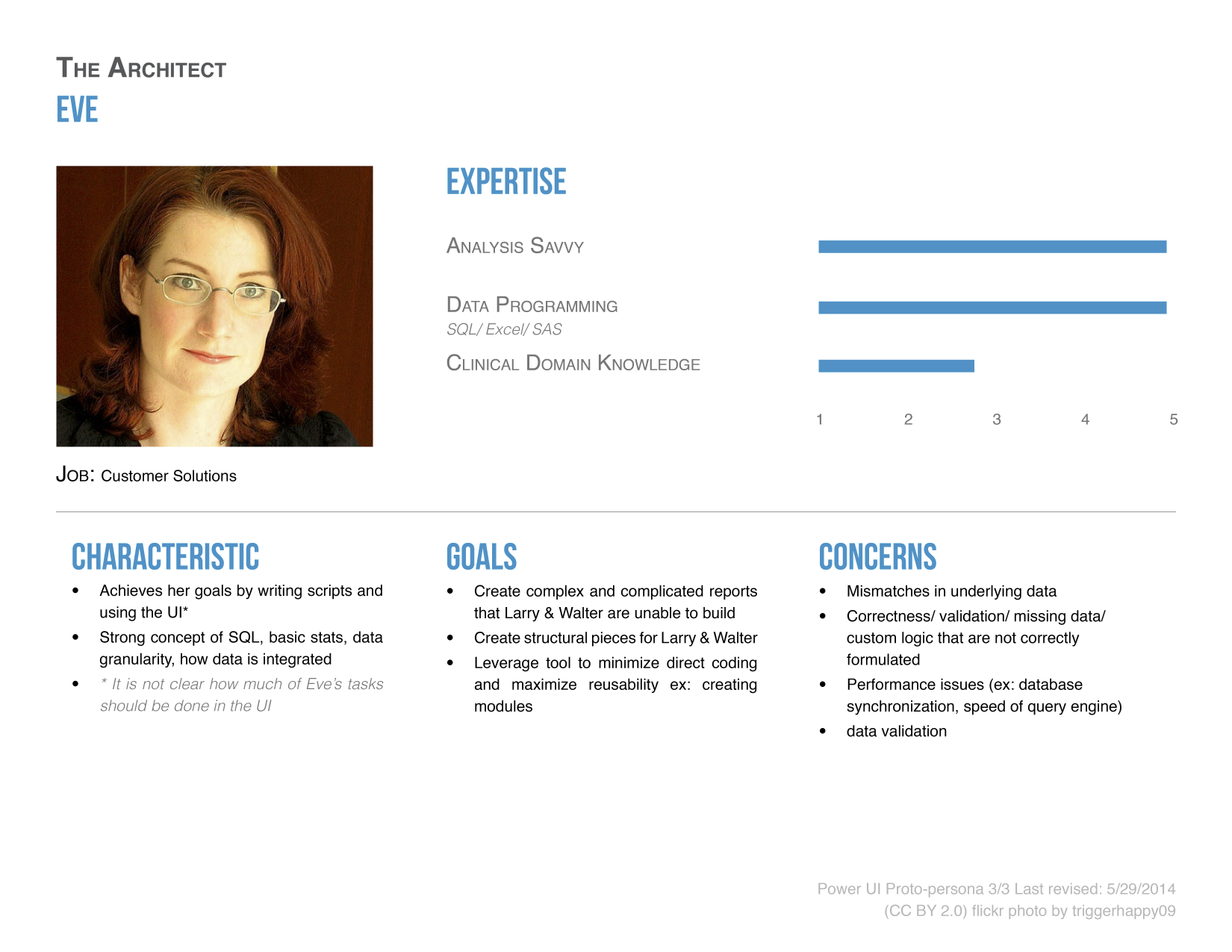
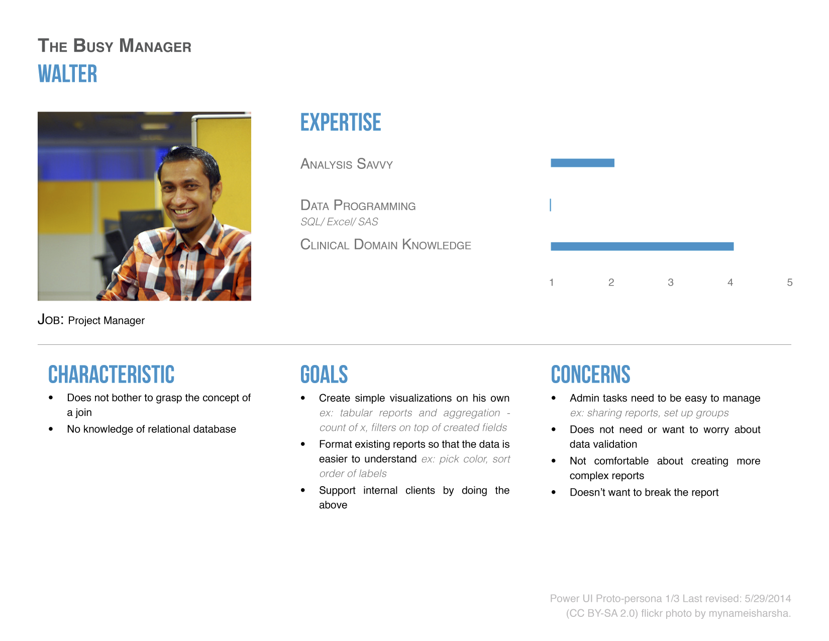
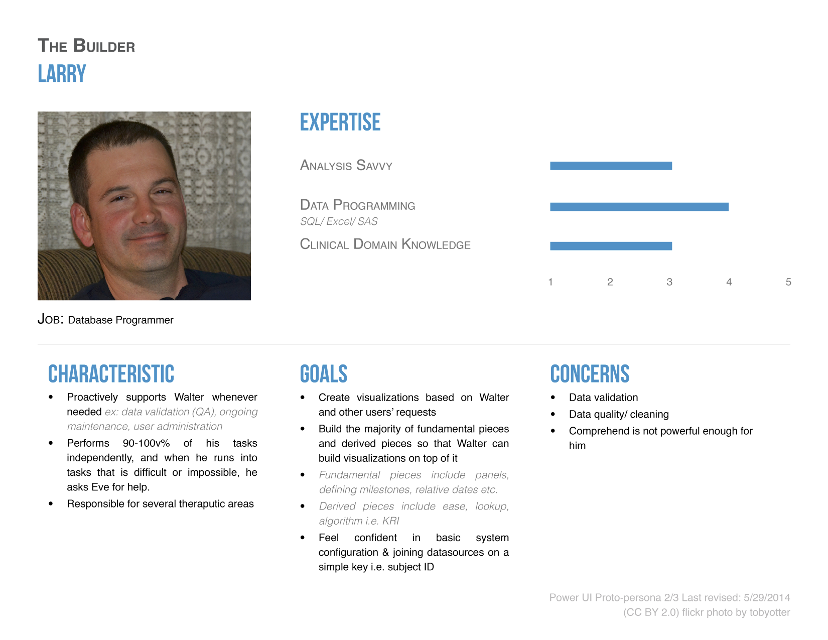
Building proto-personas for executive alignment
During product requirement gathering, I noticed that the stakeholders all had slightly different concepts of our users. To address that, I facilitated a proto-personas building workshop to ensure the CEO, CTO, Product and Engineer team all shared the same vision.
These proto-personas eventually led to an important discussion on the scalability of the product. The names of the proto-personas were constantly being referenced during the conversation. These proto-personas were later validated and modified with data from interviewing our current users and consulting industry experts. They were also shared with the product, engineering, sales and marketing teams and continued to be used in our regular discussions.
A lean UX approach to create team-wide alignment
I used a lean UX approach which emphasizes iterations of rapid sketches, prototyping, user and team feedback and mockups. This lets me leverage the perspectives of my co-located team and align with the Agile development approach we follow at the company.
Turning Insights Into Design Concepts
After identifying the key scenarios, I defined the primary user flows in our tool and turned the key research discovery into design directions.
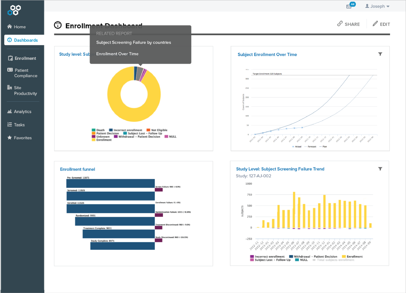
For example, a primary scenario is for a user to deep dive when there are potential operational issues. When that happens, she needs to investigate the causes and take corrective actions. This inspired the concept of 1) helping users navigate between reports of various level of data, as well as 2) increasing data transparency by always showing filters applied to data.

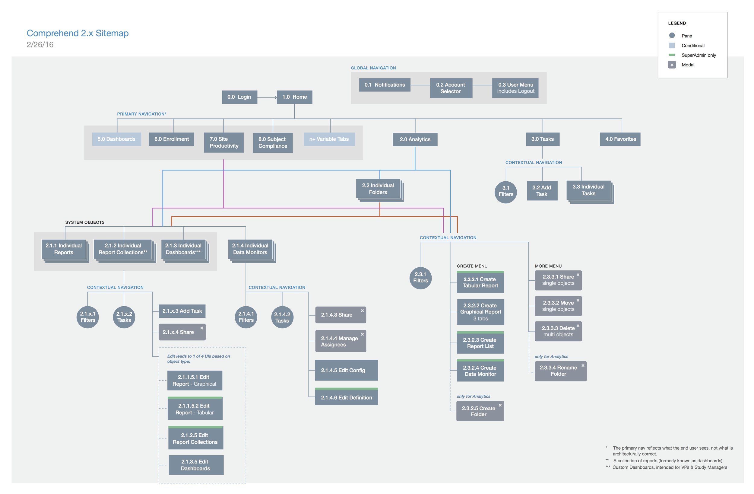
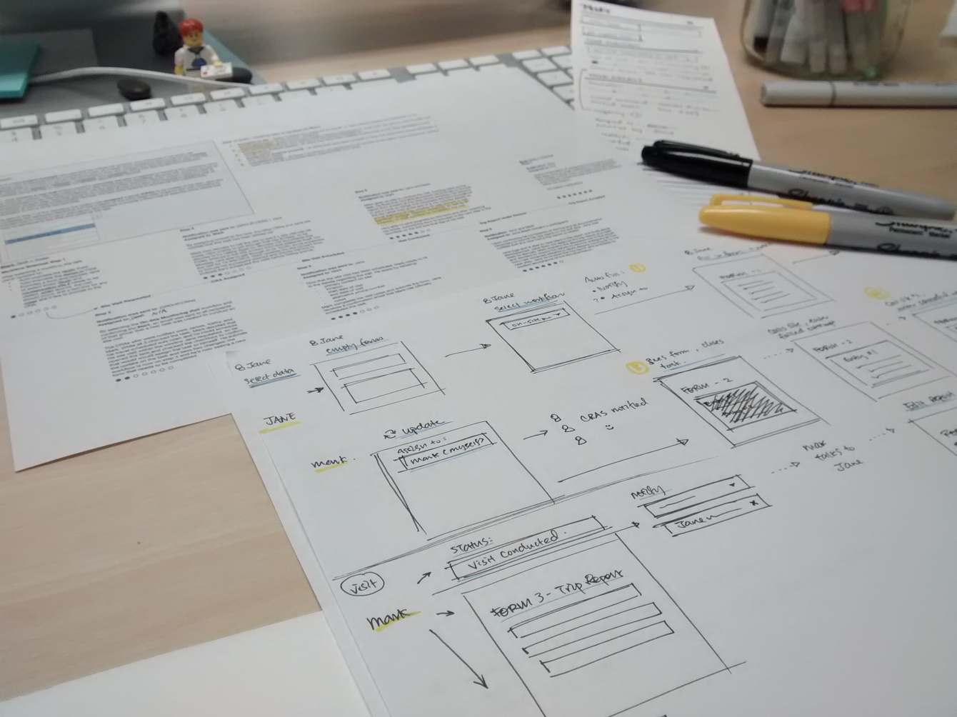
A sketch of the data navigation concept
I generated sketches and conceptual wireframes to explore the overall structure of the experience including navigation patterns, arrangement of UI and key interactions. In the meantime, I worked with another designer to build our style guide. Our vision started to come together.
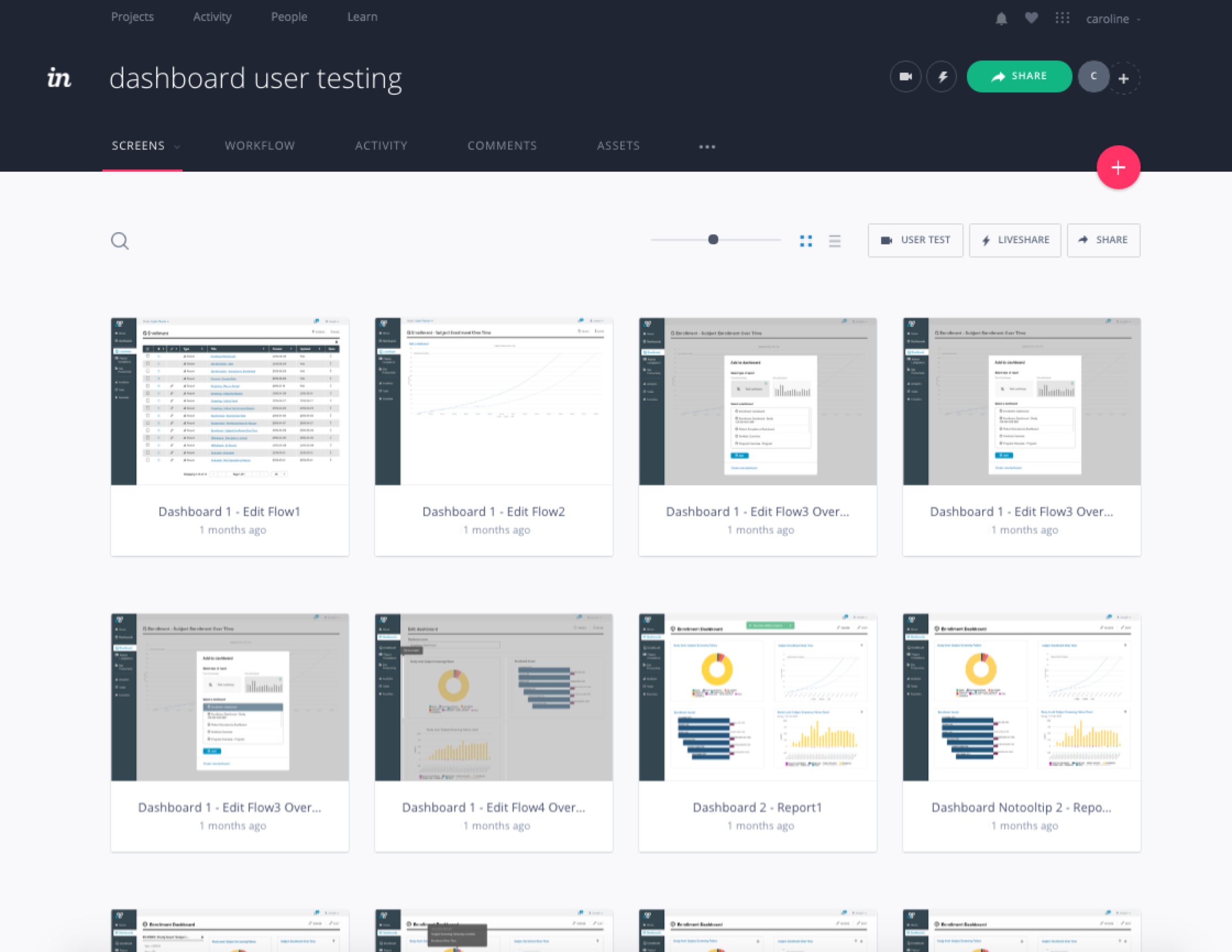
Interactive Prototypes & User Testing
Following a lean UX approach, I created prototypes and ran remote user testings approximately every two weeks, which helped us address usability issues. In addition, I ran guerrilla user testing with internal users. Operating under a very tight project timeline and budget, I handled all the work necessary to conduct user testing including recruiting, screener survey, test script, prototype, and on multiple occasions, I conducted the user tests alone.
Since I was co-located with the engineering team, the fidelity of my deliverables varied. In some cases, I created hi-fidelity mockups with specifications to define the interaction and visual design. In other cases, I paired up with engineers to tweak the product together after the initial whiteboarding or roughs sketches. I also prototyped key interactions as a tool to facilitate discussions with my team and I often refined and recycled them for usability testing.
Results
Comprehend 2.0 made its debut at DIA, one of the most important conferences for the company. We received very positive feedback and potential customers were very excited about being able to access their real-time clinical trial data anytime on any device.
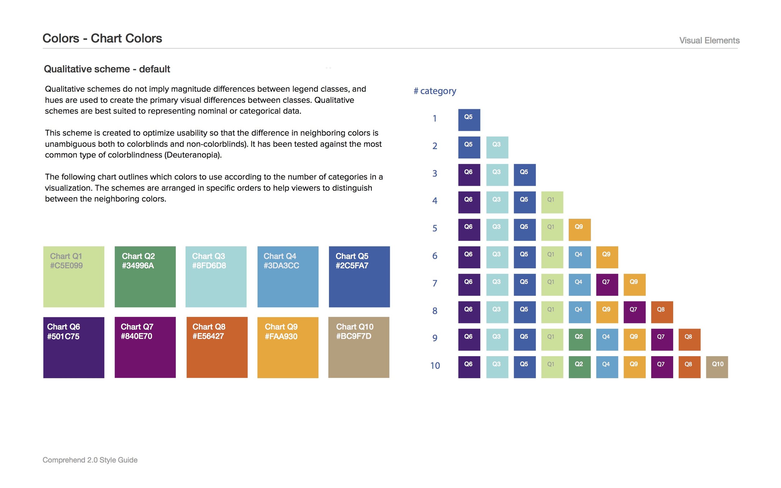
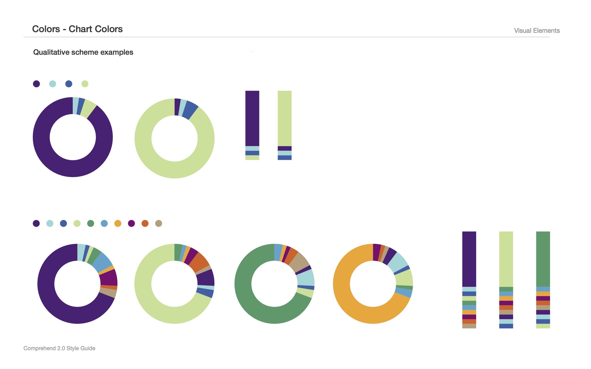
Style Guide
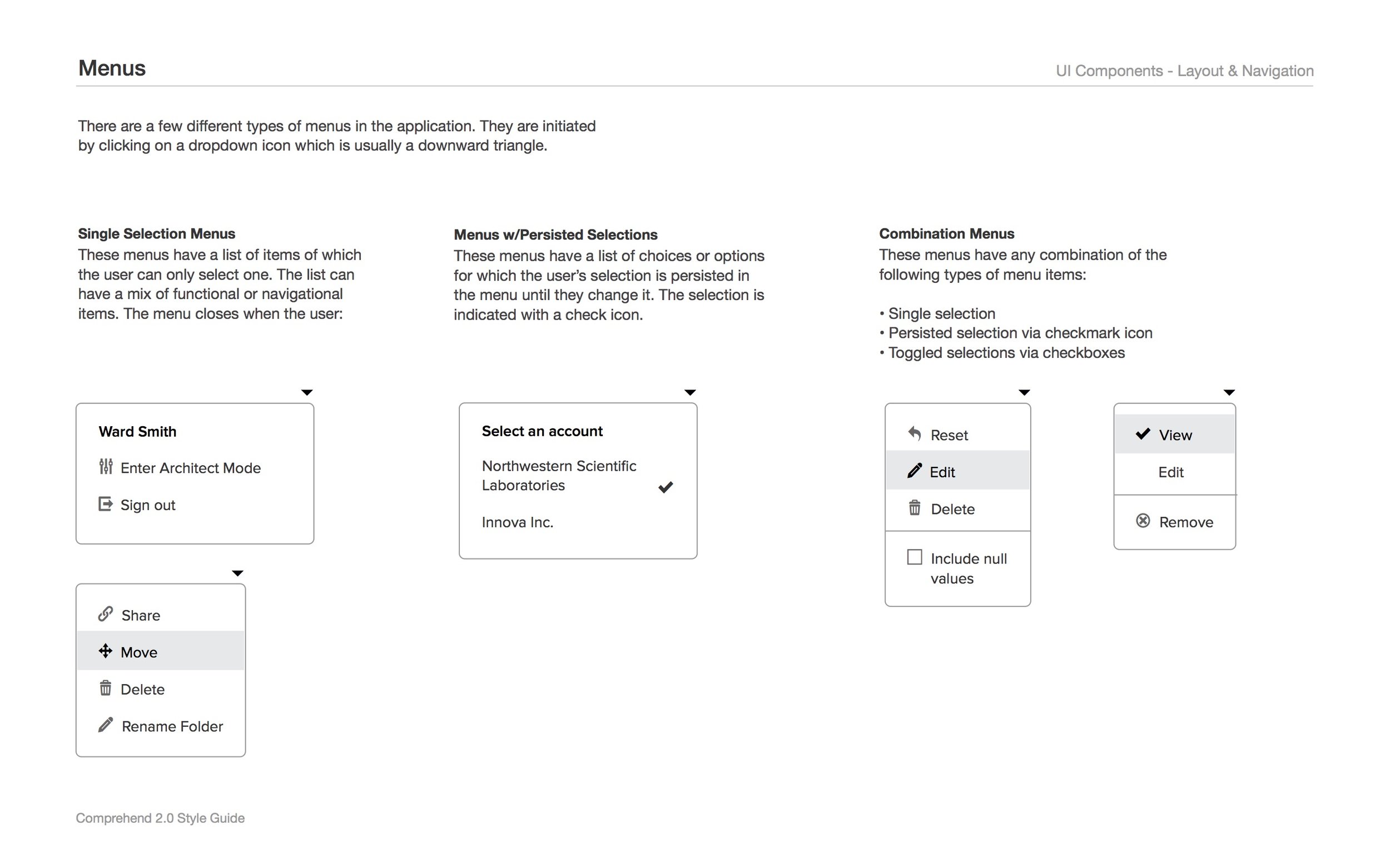
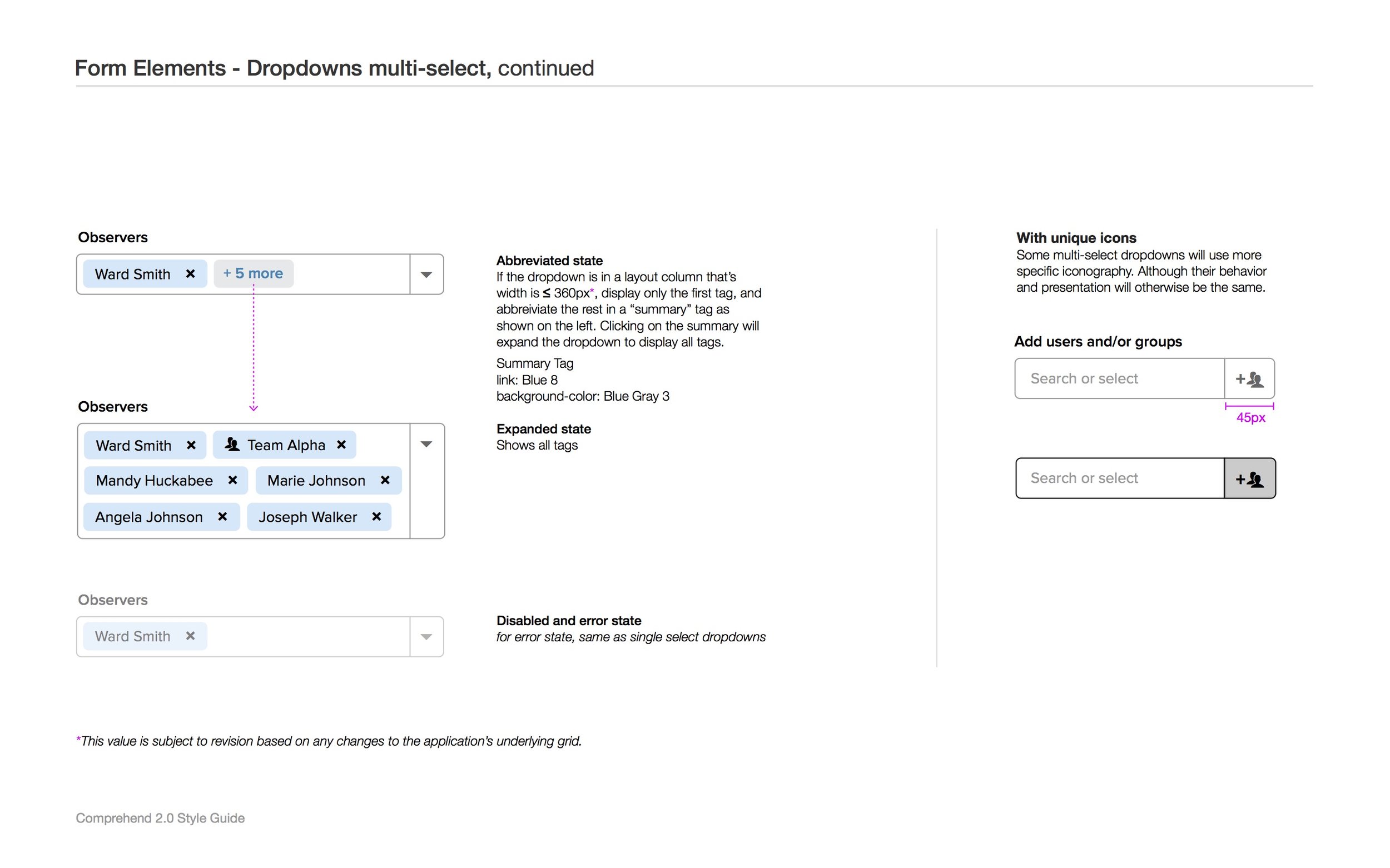
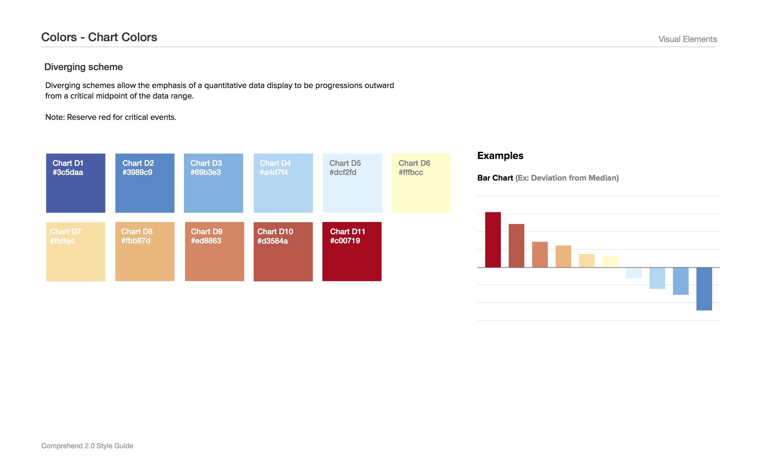
I also co-authored the Comprehend 2.0 style guide. Covering interaction and visual design patterns, this evolving style guide was critical in ensuring consistency in the user experience as well as making communication smoother.